Andromeda - Web Design
Project Info:
Design
Altimetrik
Design
UX Designer
Jun 2020 -May 2022
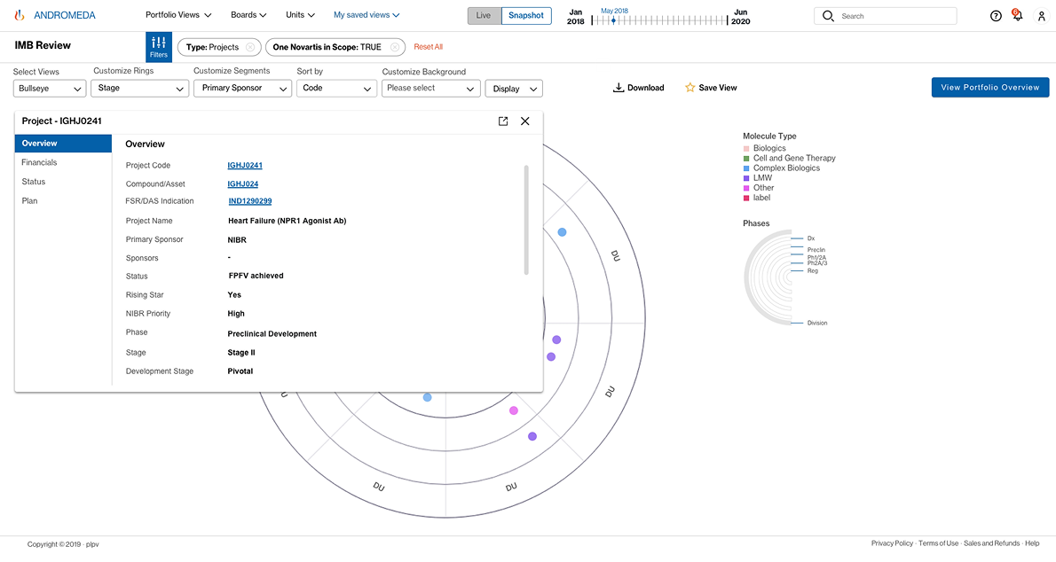
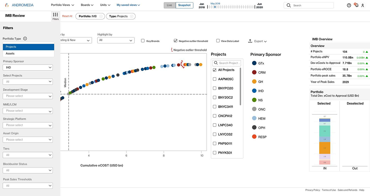
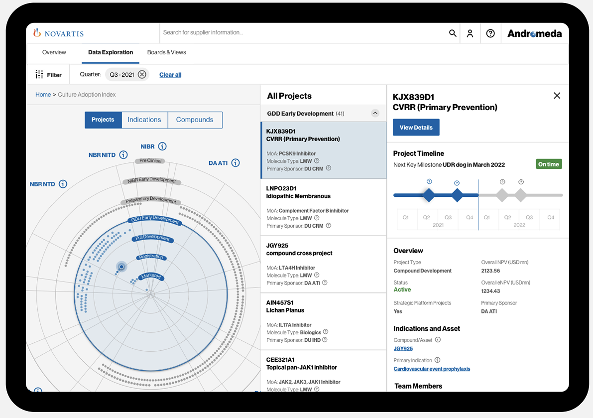
Andromeda - Andromeda is application whichwill instantly gain access to an advanced portfolio visualizer and scenario simulator. With an intuitive interface and the support of self-paced guidance, you will soon be leveraging Andromeda’s drill-down capabilities to generate project, indication and compound level details that suit your function’s needs.
Project Introduction
The current disjointed nature of its portfolio management data and system landscape creates inefficiencies requiring excessive exchange of information through email messages and slides, manually generated to answer questions or provide in-depth analyses for decision-making. No single portfolio R&D overview exists today. Andromeda is an agile cross-divisional Novartis program that offers real-time Enterprise Portfolio Insights Capabilities spanning the Novartis research, development and commercial organizations by connecting comprehensive, high quality, cleaned up and curated portfolio information to advance models of R&D flow and predictive analytics
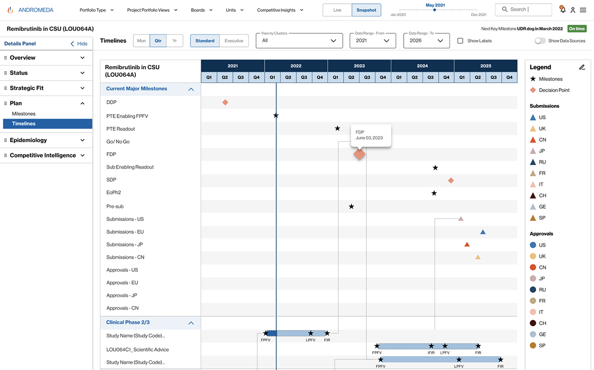
Once the data is cleaned and consolidated, Andromeda aims to provide means to visualize comprehensive portfolio information, measure its performance, assess the portfolio strategic health, optimize the allocation of resources, and use simulation and forecasting techniques to enable a better strategic view of the Novartis project and portfolio planning. As of this release, the Andromeda capabilities are grouped in 3 logical categories: -Portfolio Visualizations: What does the entire R&D pipeline from research to commercial look like?
Helps Novartis to understand where it stands End to end, transparent view on the entire R&D pipeline that provides latest details, metrics, and reports on our portfolio Consolidate data (entities, attributes and relationships) needed to describe the Novartis portfolio from Research to Commercialization
Answer key questions about the portfolio with trustworthy data on demand, significantly reducing the time and effort required to support efficient decision-making Provide Pipeline status updates are viewed live on the screen instead of static PowerPoint presentations Comprehensive, latest details on each project and indication in pipeline-Portfolio Metrics: What is the current performance of our R&D pipeline?
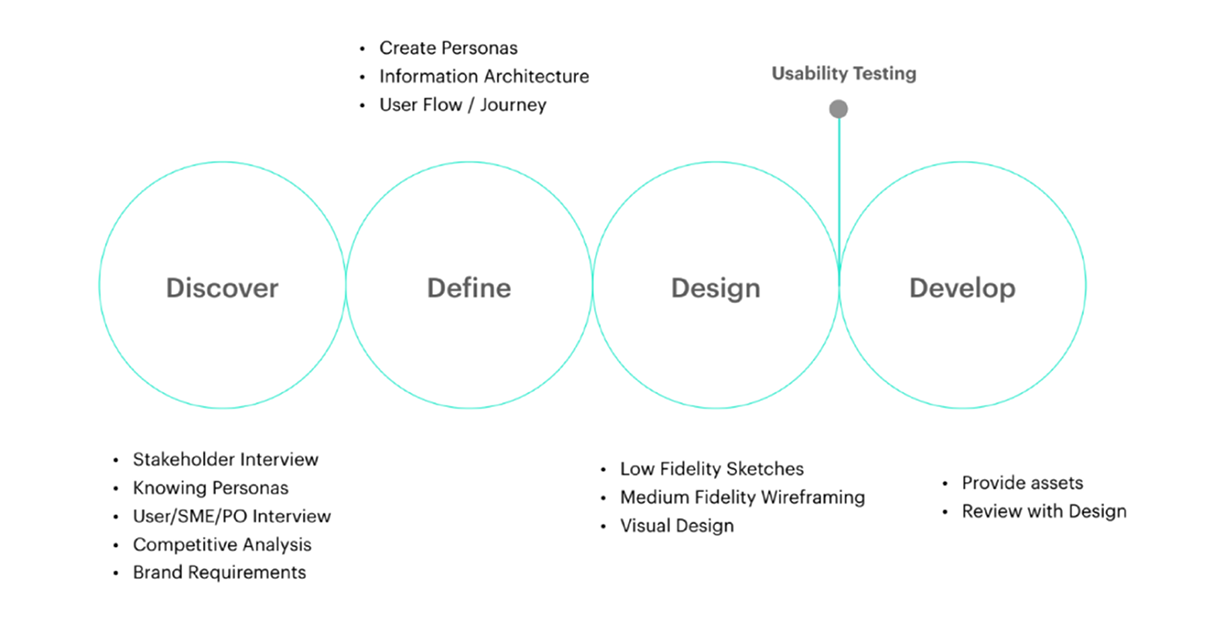
4d - Design Process
Goals & Plans
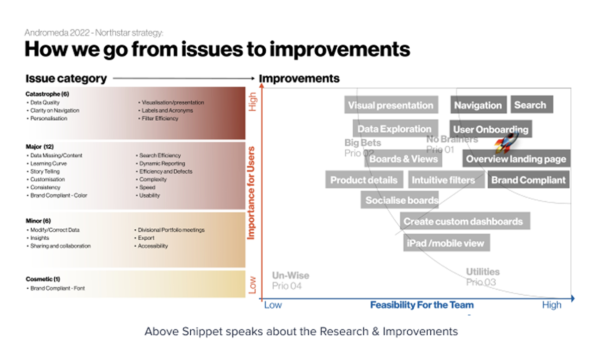
Monitor Data quality in the source system to trust the system Make the app simple, easy, accessible and usable Connect and link all data to bring complete picture (Traceability) Make it a storytelling tool. Bring Insights with the story
Phase - 1
* Make standards boards.
* Remove Unit specific board and pick the best widgets and create a unit's health board (user should be able to pick one unit and filter data).
* Make one IR board.
* Make one CI board.
* Make one Forecast board.
* Make all boards to be sliced and diced by filters.
* From Boards, they should be able to deep dive till project details page.
* If users are attached to the existing boards, those can be moved to custom board for specific set of users.
How we get started our users to participate?
We started off our research by conducting interviews. We wanted to learn more about potential users of Andromeda and to understand their behaviours and thoughts. We also provided users with few tasks to perform.
User Tasks 1/2 (Time: 20 - 45 mins)
How often would you use such a system to get insights?
User Tasks 1/2 (Time: 20 - 45 mins)
How are you doing the similar analysis, currently? What are you doing with it? Could you walk me through how you go about this?
Below is a list of questions that should be covered during this question. In the end, we will need to map out the customer’s journey and map it out.
- Why are you doing it this way?
- How do you view, find and analyse information?
- Do you need to share the data? If so, how do you go about doing this?
- Do you use any other dashboards in conjunction with Andromeda?
- What are the most and least useful presentations/ data insights you receive? Why?
- What are the biggest drawbacks to the current process? Please name 3 and rate them on a scale of 1-5 (5 is the most painful)
- What are the positives of the current process? What works well? Please name 3 and priorities them and rate them on a scale of 1-5 (5 is the most painful)
- Have you used in your previous experience or do you know any other solutions available that you would find useful? Please elaborate how do these solutions look good to you.
- What KPIs (data) and contextual information (footnotes, glossary, comments, infographics) would you like to see?
- Are some KPIs more important than others? Why? What does those KPI mean for the business?
- How does the current solution/process help you achieve your goals?
Navigation I/A
Which board is relevant to me? I forgot which board I saw that details. What is 'One Novartis Portfolio: True'. It doesn't make any sense to me. I often get lost and have to go back to home screen to start. Learning curve is steep. How do I know what these boards are?
Search
Too narrow and long list Search gives lot of false positive. Difficult to choose the right one quickly How should I know what is relevant? Sometimes data is messy and results are not always obvious
Value Add with New Navigation - Our Goal
Hiding complexity - User should not be confused Recognition vs recall - User need not remember anything, they should be able to identify once they see it. Guiding user with reduced options? (Hick's Law) - User should be able to make decision quick on where to go from home screen Familiar language to address wide user group - Choose label that is simple and commonly used Help/training - Spell out if it has spelling. Help should be easy to figure-out of they have some question.
MEGA Menu Research
As the following screenshots show, mega menus have the following characteristics: Big, two-dimensional panels divided into groups of navigation options Navigation choices structured through layout, typography, and (sometimes) icons Everything visible at once — no scrolling Vertical or horizontal form factors when activated from top navigation bars; when activated from left-hand navigation, they might appear as mega fly-outs (not shown) Menu options revealed on hover, click, or tap
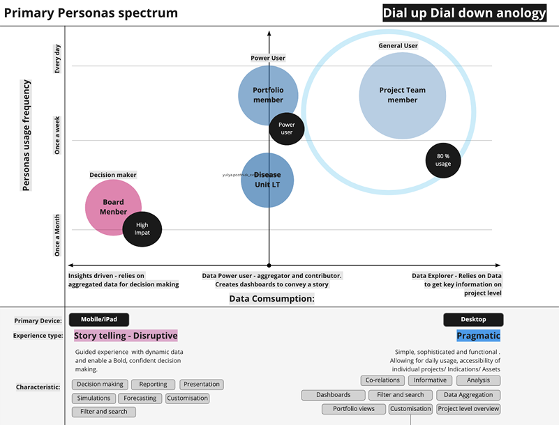
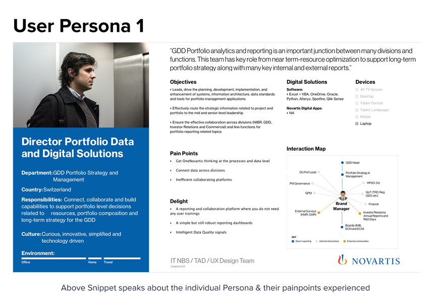
User Persona
Flexi Dashboard Research
IA - Navigation Boards
Hi-Fidelity Designs